Dangerous Goods Labels & Dangerous Goods Placards, Regulatory & Compliance
The Spectrum of Safety: Understanding Colours in Dangerous Goods Hazard Labels
Mar
When it comes to the transport and storage of dangerous goods, safety is paramount. One of the key visual tools used globally to ensure safety is the use of colour-coded hazard labels. These labels are not just for decoration; each colour has a specific function that instantly communicates the type of hazard associated with the material. Here’s an exploration of the colours used in these labels, why they’re chosen, and how they help in maintaining safety standards.
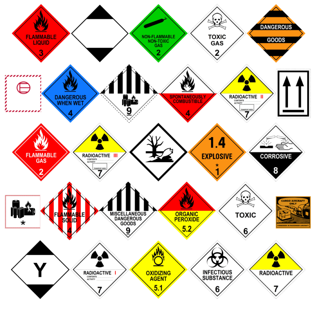
Orange: Explosive
Colour Significance: Orange is universally recognised as a warning colour. In the context of dangerous goods, it signals materials that are explosive. This includes substances like flares, fireworks, and explosives.
Label Examples: Division 1.1 mass explosion hazard.
Division 1.3 fire hazard, minor blast hazard and/or a minor projection hazard.
Division 1.4 No significant hazard.
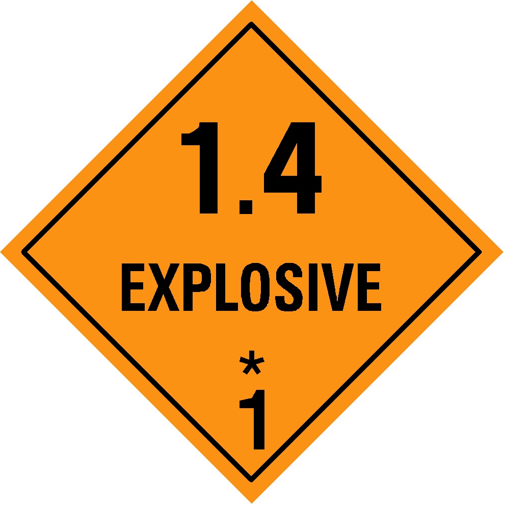
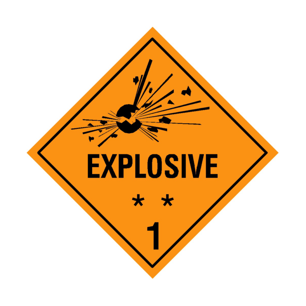
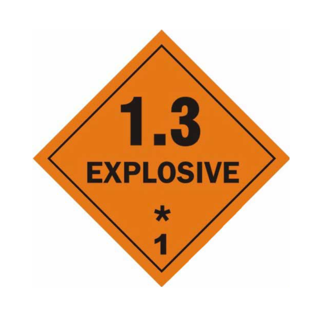
Why Orange? The colour orange is used for explosives hazard labels because it’s highly visible and universally associated with caution or danger. Orange provides a striking contrast against various backgrounds, making it easy to spot quickly — even in low – light or chaotic conditions like a busy port or ship deck. Orange is attention-grabbing and distinct from other hazard classes (like red for flammables or green for non-flammable gases), reducing confusion. Its use dates back to early safety standards, where bright, warm colours were selected to convey urgency, and orange emerged as a practical choice for explosives due to its clarity and availability in durable materials like labels and signs.
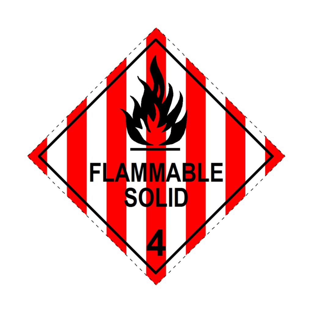
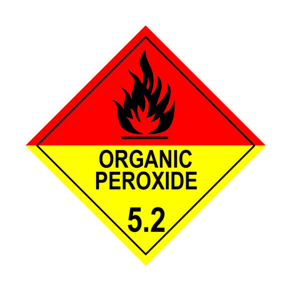
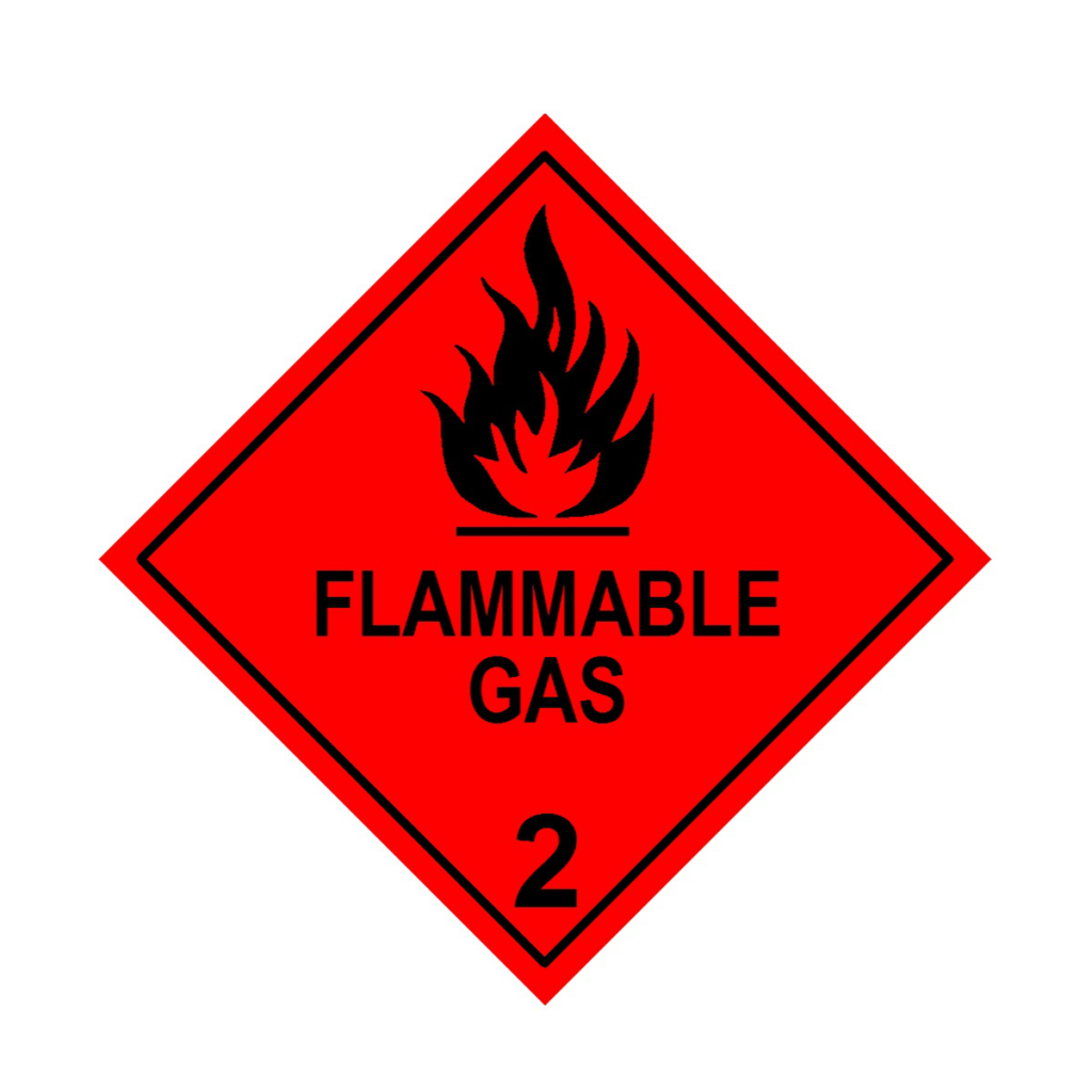
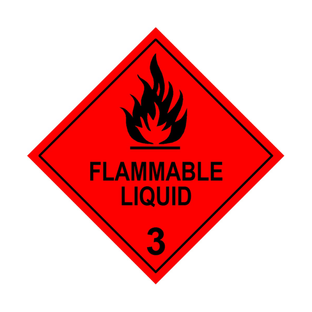
Red: Flammable
Colour Significance: Red is universally recognised as a warning colour. In the context of dangerous goods, it signals materials that are flammable. This includes substances like petrol, paint, adhesive, and flammable gases.
Label Examples of hazard labels that have the colour red: Class 2.1 (Flammable Gases), Class 3 (Flammable Liquids), Class 4.1 (Flammable Solids), Class 5.2 (Organic Peroxide).
Additionally, red stands out distinctly from other hazard colours like orange (for explosives) or yellow (for oxidizers), helping to avoid mix-ups in classification. Its high contrast and visibility on packaging or placards make it practical for real-world use, ensuring that anyone handling or transporting these materials knows to keep flames, sparks, or heat sources far away. Simply put, red screams “fire hazard,” prompting the caution needed to prevent disaster.
Why Red? The colour red is used for flammable hazard labels because it’s widely recognised as a signal for danger and urgency, making it an ideal choice to warn of fire risks. Red’s association with danger comes from both nature (think fire, blood, or heat) and human convention (stop signs, emergency alerts), embedding it deeply in our collective understanding as a call to take immediate notice. For flammable materials, this is critical: a spark or heat source near these goods could lead to rapid combustion, so the bright red background on labels, often paired with a black flame symbol, ensures instant recognition by workers, shippers, or emergency responders, even in high-pressure or low-visibility situations.
White: Miscellaneous Dangerous Goods
Colour Significance: White or occasionally black on white backgrounds are used for miscellaneous dangerous goods that don’t fit neatly into other categories but still pose a risk.
Label Examples: Class 9 (Miscellaneous Dangerous Goods), Class 9 (Lithium Batteries), Class 9 (Sodium Ion Batteries).
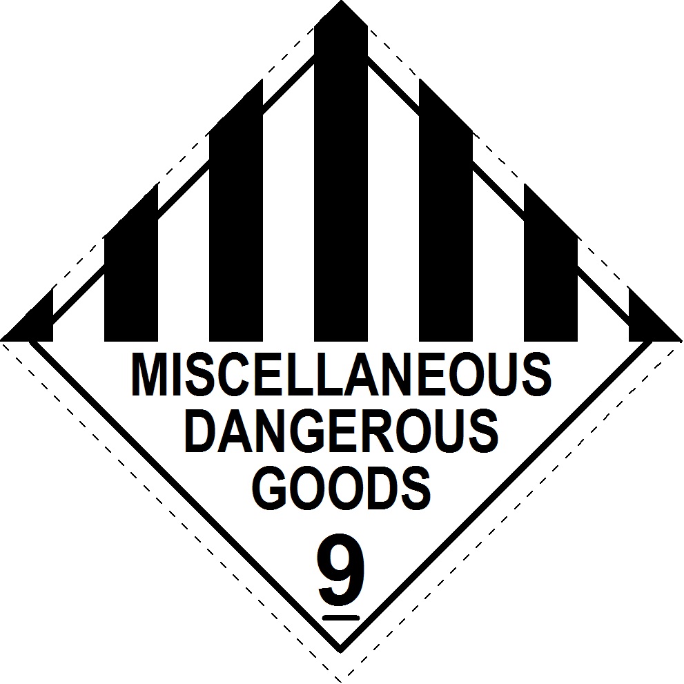
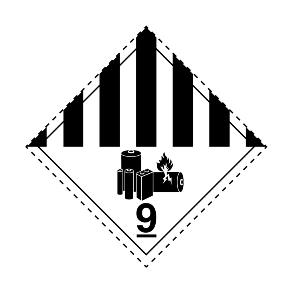
Why White? White ensures high contrast against most backgrounds, enhancing readability. It’s less about warning of immediate danger and more about indicating that special handling might be required due to various other hazards.
Green: Non-Flammable, Non-Toxic Gases
Colour Significance: Green labels are for non-flammable, non-toxic gases, which still need careful handling due to pressure or asphyxiation risks.
Label Example: Class 2.2 (Non-flammable, non-toxic gases).
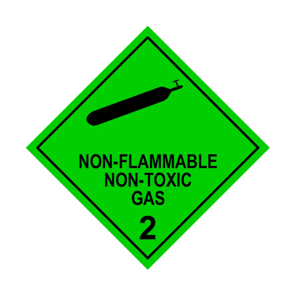
Why Green? Green is often associated with safety or non-hazardous in other contexts, which makes it a counterintuitive but effective choice here to differentiate from other more hazardous gases.
Conclusion
The strategic use of colour in dangerous goods labelling is not just about aesthetics but safety. Each colour is chosen based on its psychological impact, visibility, and the need to communicate quickly and effectively about the nature of the hazard. By understanding these colours, anyone involved in the transport, handling, or storage of dangerous goods can quickly identify risks, take appropriate precautions, and ultimately, help prevent or minimise accidents. This system of colour-coded labels is a testament to how visual cues can significantly enhance safety in potentially hazardous environments.